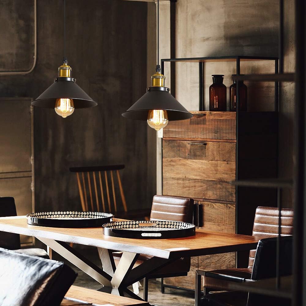
Why Do Some Black Light Fixtures Look Premium While Others Look Cheap?

Black lighting is popular because it feels clean, graphic and easy to combine. Yet two fixtures with similar shapes can look completely different. One feels precise and expensive. The other feels flat, plastic or poorly finished.
Not every black finish looks the same
A deep, even black usually feels more refined than a greyish or inconsistent finish. Thin paint can expose variation around edges and screws. Matte black works well when the coating is smooth and consistent.
Black reveals surface texture
Black hides some colour variation but makes texture easier to notice. Thin metal, ripples and mould marks become visible under side lighting.
Edges, seams and joints matter
The join between metal and diffuser, exposed screws, cable entries and canopy edges are easy to see on black fixtures. Clean alignment makes the fixture feel precise.
Good proportions matter more than decoration
A simple black ring can look expensive if the frame thickness, canopy size and overall scale feel balanced.
Light colour changes how black feels
Warm light around 2700K to 3000K softens black and works well with timber, beige and brass. Neutral light creates a sharper graphic look with white, grey and concrete.
Room contrast changes the result
A black ceiling light on a white ceiling creates a strong outline. On a dark ceiling it becomes much quieter.
Other materials can add depth
Glass, timber, brass or white acrylic can break up a large black surface and make the design feel more layered.
What to check before buying
- Whether the black finish is even.
- Surface texture.
- Edge finishing.
- Alignment of parts.
- Visible screws and joins.
- Frame thickness.
- How the fixture looks switched off.
FAQ
Does matte black always look more premium?
No. It works well only when the coating is smooth and even.
Is black metal always better than black plastic?
Not automatically. Manufacturing quality still matters.
What colour temperature works well with black fixtures?
Warm light suits timber and beige interiors. Neutral light works well in more graphic spaces.
Conclusion
A black light fixture looks premium when colour, material, proportions and detailing work together. Black can be elegant, but it also makes imperfect surfaces and joints easier to see.